
Brand Identity
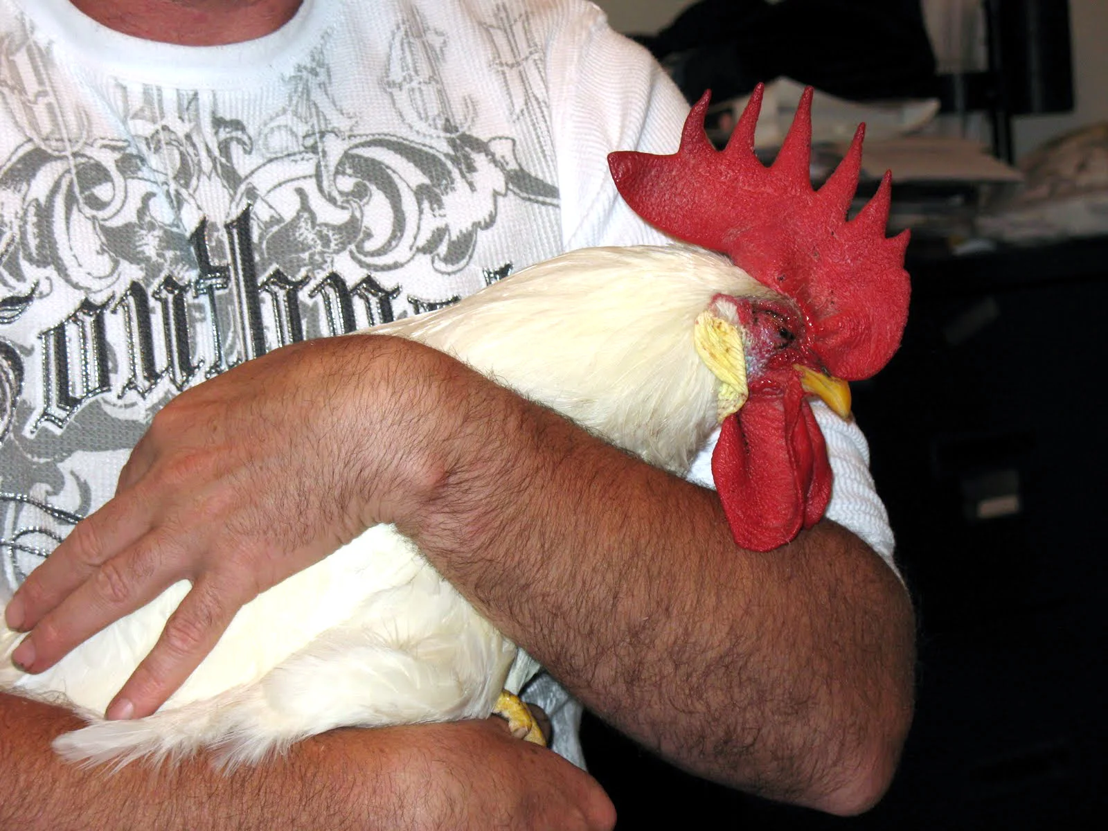
Randy Rooster a Las Vegas inspired apparel start-up focused on combining tongue-in-cheek sayings with retro inspired graphics. The 2003 original logo didn’t capture the brand’s vision or character; the founders wanted a modular logo to be extremely flexible and universal in this digital age.

2003

2011
Modular Logo
The modular logo served the dual purpose of representing the brand and being an open container. Modern brands are dynamic and responding to use case scenario across social media, video, print, apparel, woven label systems and more. The modular logo creates wide array of new possibilities to engage the consumer.

In collaboration with Brooklyn artist John Reardon of Greenpoint Tattoo we developed the most complex graphic version of the logo first. Inspired by traditional American tattoos, Chinese and maritime superstitions, Luck, and hand done typography.


This complex graphic served as an open interactive signifier with multiple elements and symbolism to play with in the more pared-down logo counter parts. Designed to be an image-holder that could hold copy and be used on for print, denim back patches or t-shirts in the future. Simultaneously interactive and with the ability to change, able to pare down to just the clean wordmark or clean trademark.
Inspiration


Client: Randy Rooster
Illustrator: John Reardon
Software: Photoshop, Illustrator, and Keynote
Roles: Brand Identity, Art Director and Graphic Design