Transformation from Legacy to Modern platform
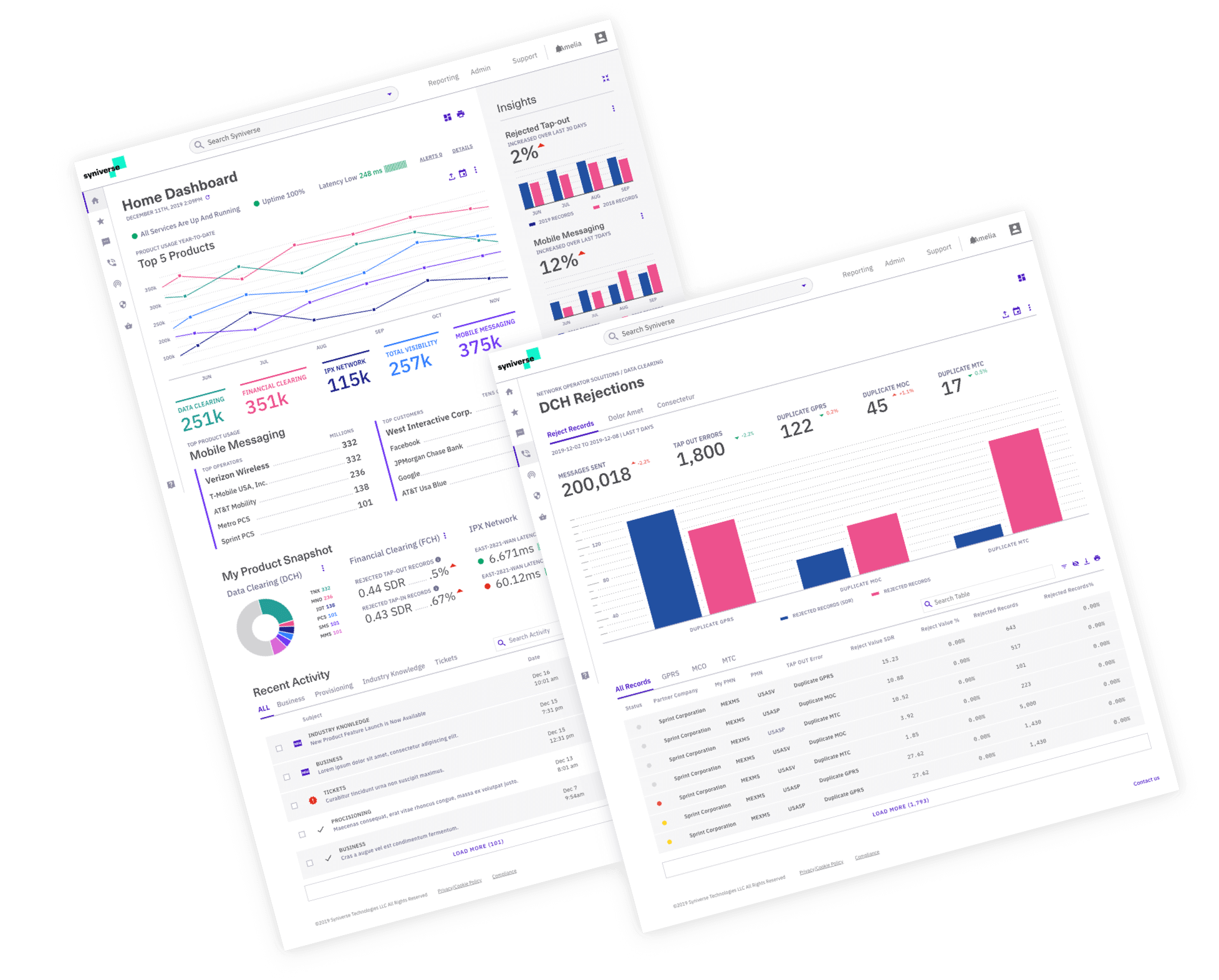
Revamped Syniverse’s fragmented portal and legacy systems, conducting detailed audits, user interviews, and workshops to gather insights into usability challenges and customer needs. Applied Human-Centered Design (HCD) to create user archetypes and map tailored journeys. Through three targeted design sprints, developed a scalable, branded design system that streamlined navigation and unified the user experience, increasing usability and customer satisfaction.
Key issues included high complexity—80% of users only accessed 20% of features—and a dependency on customer support due to unintuitive design, with disjointed apps across platforms exacerbating user frustration. Additionally, 32% of B2B marketers identified integration issues as barriers, leading to siloed apps and inconsistent user experience.
Active and hands-on role, responsible for overseeing the daily activities of the team on design insights, team effectiveness, and client relationships.
Collaborated with Principal UX Designer on the broader project vision while guided the project’s style, methodology, collecting client feedback, and best practices to be shared with the broader team.
Syniverse is a bold, vibrant brand that connects companies, people, and communities — helping to reimagine possibilities while freeing partners up to focus on innovating their industries
Product Current State Analysis
Conducted an audit and report of the current products, brand patterns, and design language . While identifying challenges and opportunities within the organization and products.
Presented initial user interface concepts to key stakeholders before starting design sprints while set client expectations what key visual areas will be solved.
Project Engagement Goal
Strategically improve the customer experience by focusing on the modernization of the client's product portals as the critical touchpoint, while creating a global design direction that will extend across Syniverse
Problem Solving Approach
Utilizing 3 design sprints, workshops, product flows and guidelines to reshape future Syniverse's products, ensuring the brand can leave its bold, innovative mark on users.
Understanding user behaviors, needs, and motivations through observation techniques, task analysis, and other feedback methodologies. Created User Archetypes based on different needs, priorities, and approaches users when using Syniverse's services and tools
Used post-it activities and workshops to create alignment between vital stakeholders to ignite collaboration, conversation, and accelerated decision making
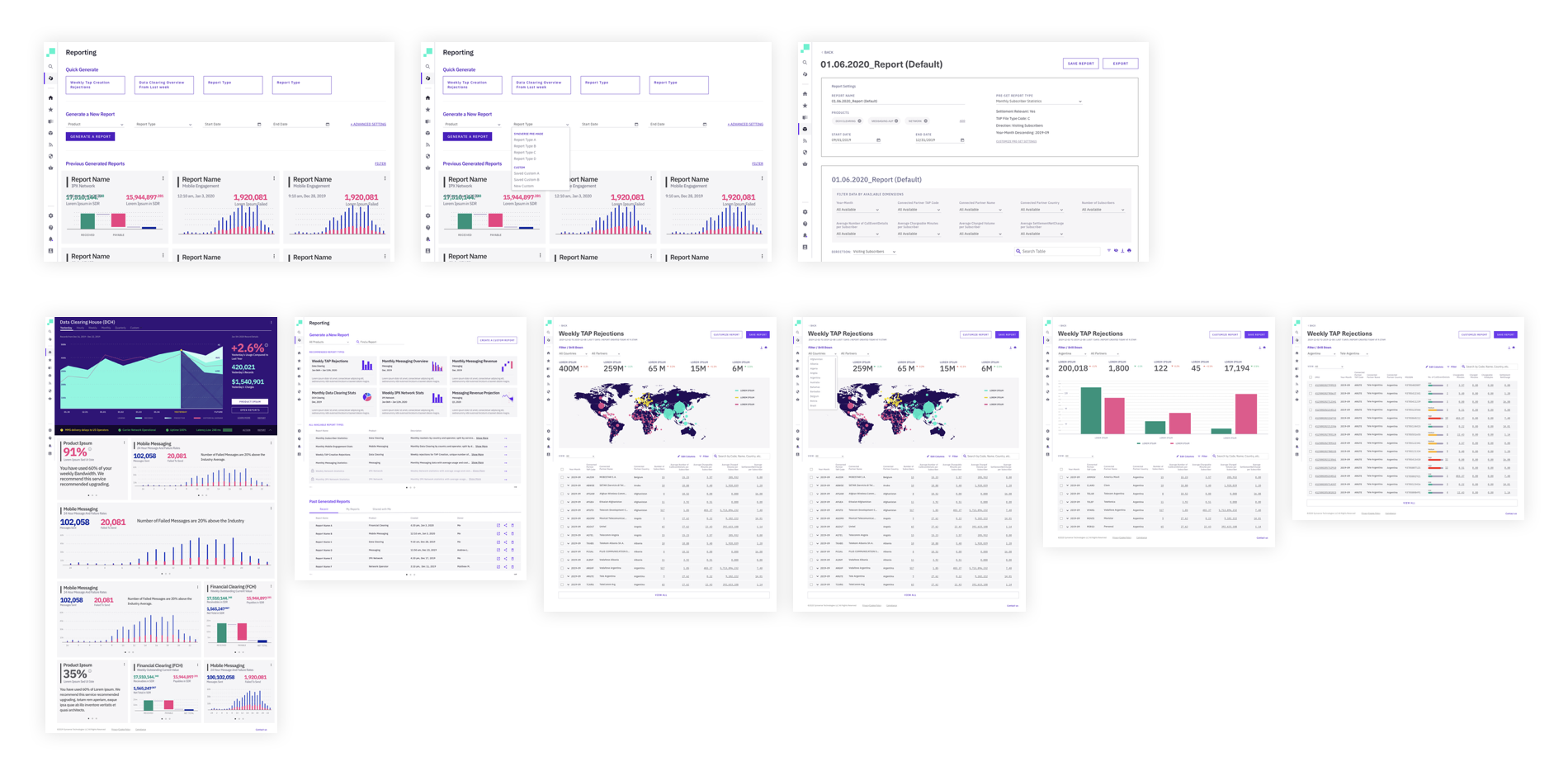
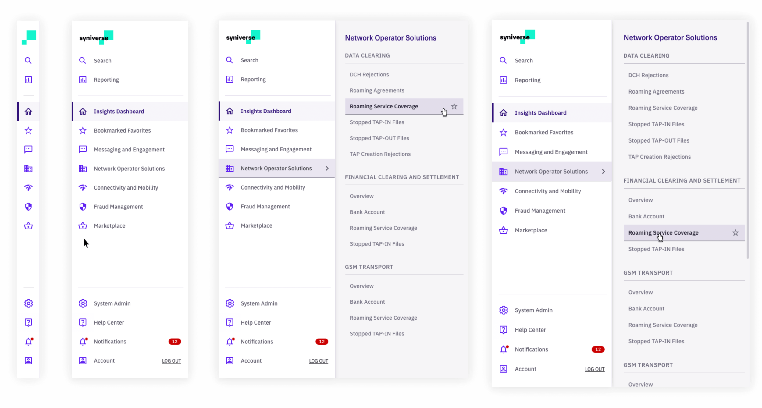
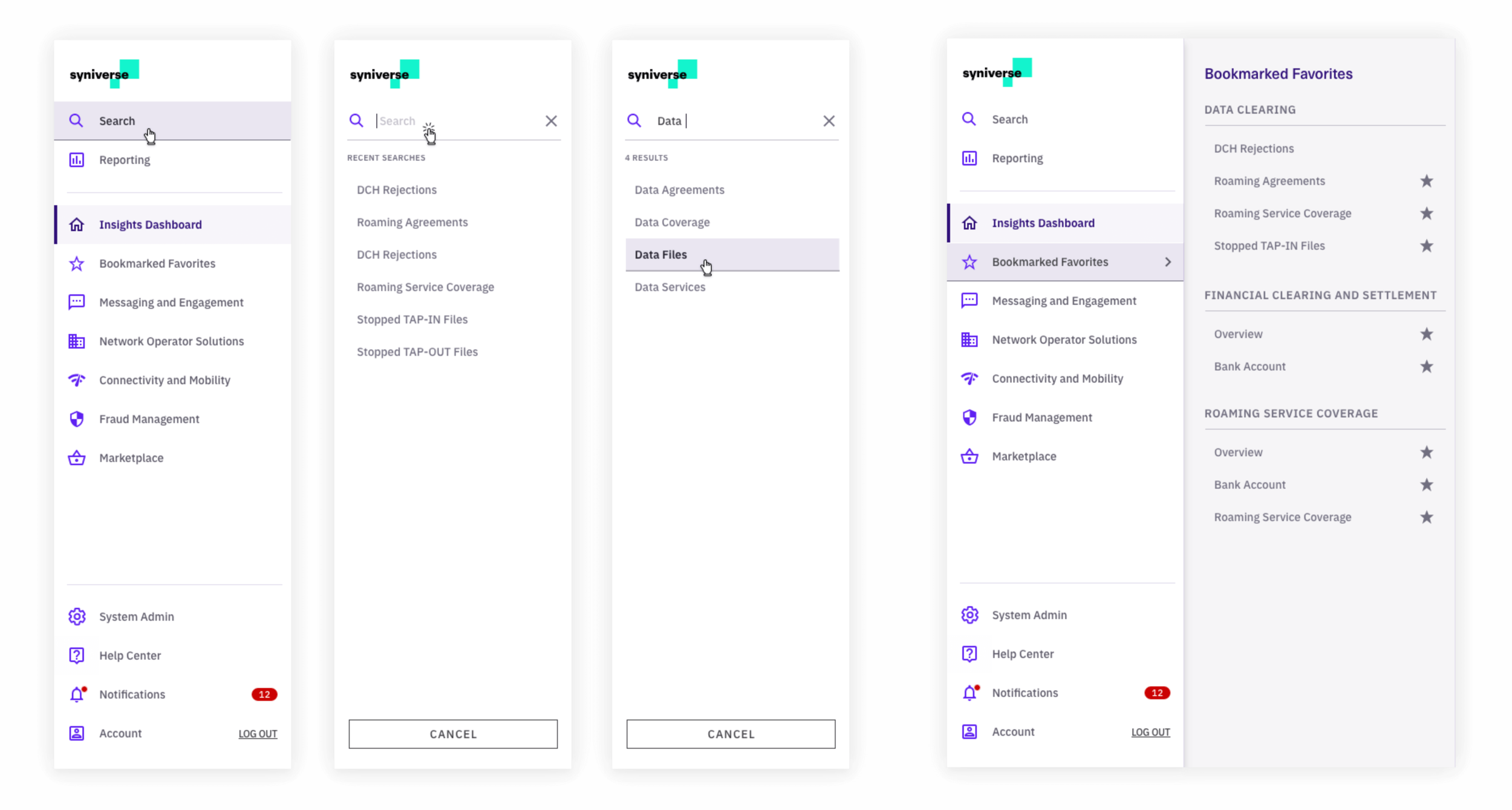
Dashboard Wireframes
Initial wireframes and interactive prototypes for dashboard and reporting served as a skeleton for future design.
Iterative design using cyclic process of prototyping, testing, analyzing, and refining the product
Used high-fidelity to examine usability questions in detail and make conclusions about the user behavior
Human-centered design research enabled the development of new solutions for Syniverse while continuing to engage customers and stakeholders throughout the engagement
Design Language
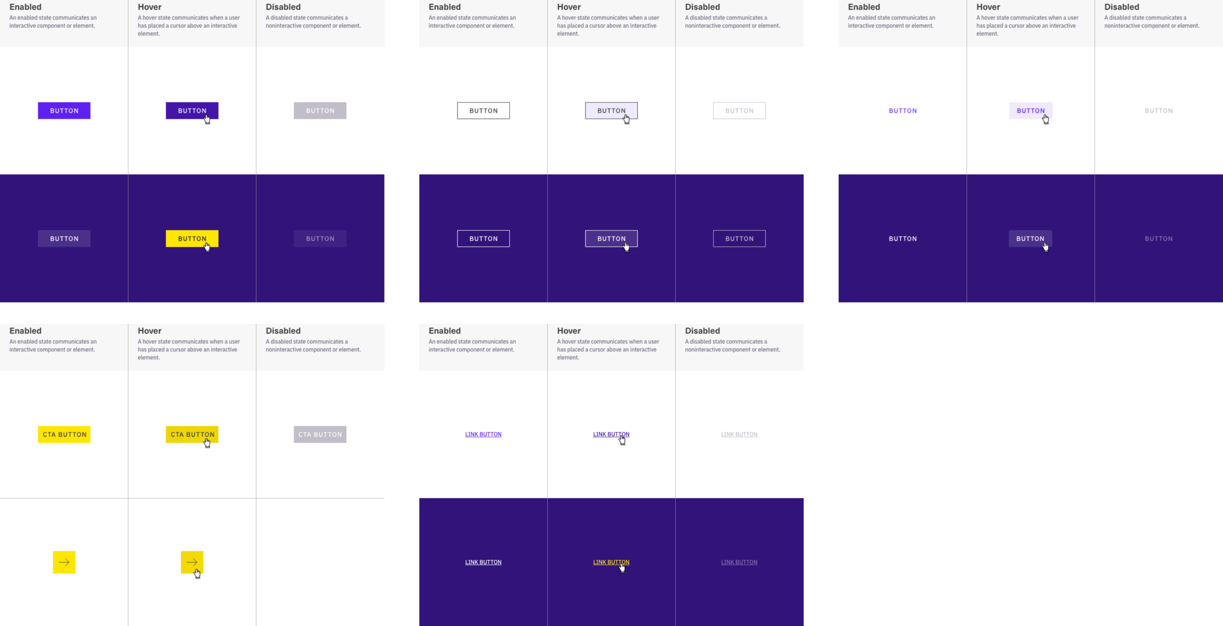
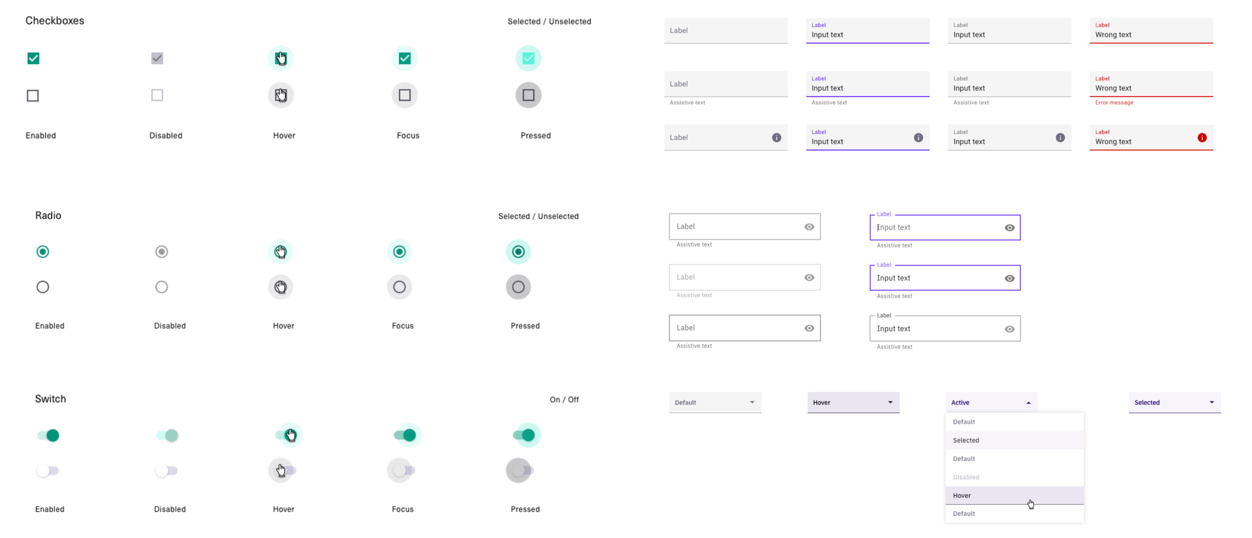
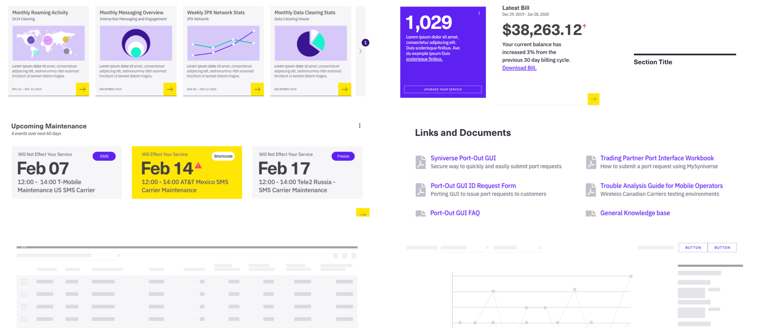
Documented and delivered a scaleable design system comprised of tokens, styles, components, patterns, and logic for development and future engagements. Backend framework was Angular Material delivering a lean, lightweight end-to-end solution for creating branded, systematic, and unified products.
Defining Visual Attributes
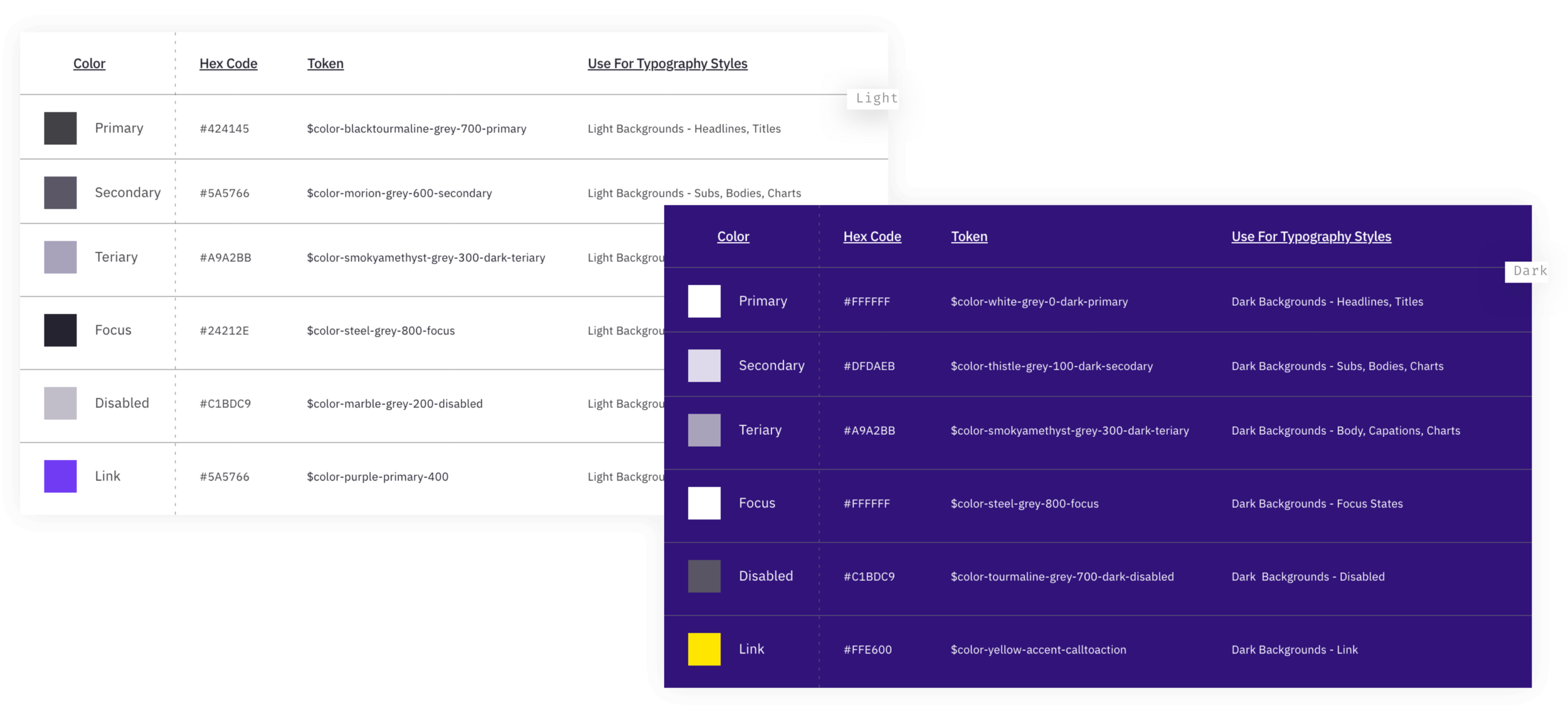
Color Baseline
Leading with Syniverse's brand purple convey confidence and knowledge that helps enable decision-making, and supported by both Syniverse's teal that elevates the design system and Syniverse's yellow adding bold energy and clear crisp actionability to identify call to actions and insights
Typography Baseline
Neue Haas Unica Pro is bold and contemporary, with a classic feel. Used as the primary font for Syniverse's marketing, it complements the unique characteristics of the brand logo. Used for headlines within the design system.
IBM Plex Sans is a grotesque open-source typeface that with excellent legibility for print, web, and mobile interfaces. Used for body copy, charts, and tables for maximum readability within the design system.
Typography and Icon Colors
Guidance on combining typography and color tokens including how to be applied to other screen elements, such as icons used to create clear, legible and actionability regardless of background-color
Data Visualizations
Created guidelines on the design of visualizations and charts to craft readable, comparable and story-driven tools to help to enable users in the decision-making process. Along with micro interactions, mobile transformation and accessibility.
Components
Documentation
Created and maintained web-based style guides that integrates with design tools (Sketch, Figma, and XD) and developers (HTML, Storybook, and Jira).
Client: Syniverse
Agency: frog design
Software: Adobe XD, Zeroheight, Airtable, Otter Audio, Illustrator, Keynote, and Trello
Roles: Visual Design, Research, Branding, User-interface, User-experience, and Interactive Design


